
Mettle Magazine is about people.
More explicitly, it's about identity, and how that manifests itself on the people of Manchester. The concept of metamorphosis was decided on by MMU professors in the Storehouse Unit that taught editorial design. A publication was to be created from concept to production following this exact topic: "metamorphosis". The team's interpretation of this went, after some exploration, to people. Returning to the idea that people create themselves and morph themselves into different versions, or life does it for them. From this, very different branches could be born, niches, that would represent metamorphosis effectively; however, the general concept of identity left the biggest impact during research, drawing the team's interest towards the way this made itself shown in the people around them: how they dressed, how they moved, the objects they bought, their accessories, their personalities, and later, even the way their rooms looked and their most private of thoughts about their own identity.
Mettle Magazine became a very intimate and moving reflection on a collection of young people in Manchester, and the way they carry themselves through life and morph into this version of themselves seen in the original photographs of this magazine. This was one of the most collaborative and enriching processes that Eva has been a part of, even as she was adjusting to the exciting new culture of the United Kingdom. It was created through a detailed creative process that resulted in interviews in Chris, Myriam & Chris's student homes. The idea was to have this be the first issue of the magazine, focused on students, and later expanded into different categories of people, getting to know Manchester and its people as a whole. This creates a connection that is intimate and unexpected in such a public context. The people interviewed were surprisingly eager to talk about themselves and this topic of identity, as it isn't often touched upon, but it was largely present in each person's life, and could be said to be one of the biggest connectors between us.
The style of photography involved maintaining this very intimate feel through nostalgic cameras, close-ups, and diverse subject matters that reflected the identity of each person. The layout created a playful and maximalist use of the grid that made the magazine feel more personal. This was counteracted with an extremely clean and structured alignment in the typographic design. The magazine is divided into three sections: one for each of the people interviewed, and uses scanned handwriting and objects to further develop the construction of the concept.


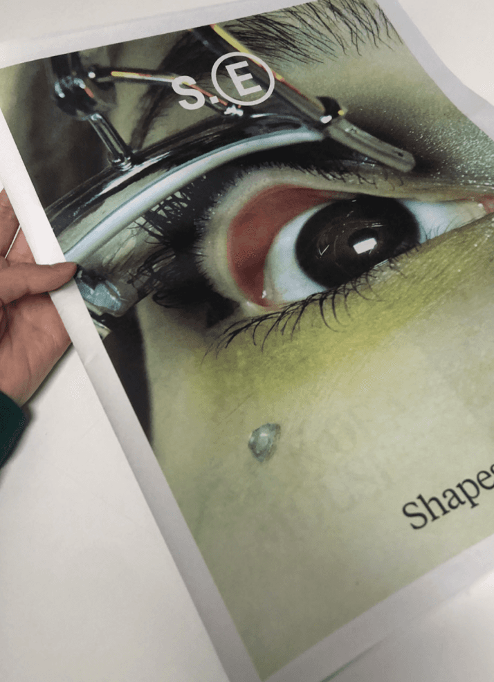
This magazine remained as a personal project and was not officilaly published.
It was featured in Manchester Metropolitan University's design magazine.
It was also selected to be presented at a school exhibition.
TEAM
Design & Direction: Charlotte Wardle, Ellie Colman, Eva Schroeder, Izzie Lowings
Typographic design: Eva Schroeder
Photography: Charlotte Wardle, Ellie Colman, Eva Schroeder, Izzie Lowings
(All original photographs)
Interviews written by Eva Schroeder, Direction & Written Content: Charlotte Wardle, Ellie Colman, Eva Schroeder, Izzie Lowings
Logotype Design: Ellie Colman
COLOPHONE
Size: 21x29.7 cm, 120 pages
2024