In collaboration with G.F. Smith x Colorplan x Father for the "PORTAL" student project on Music and Color, this concept arose from a researched reflection on the origin of music (in reference to Father), and the origin of color printing (in reference to G.F. Smith + Colorplan). The origins of printed polyphony and the technological developments in printing color, inspired the concept of "Timeless Experiences of Music and Color" honoring how far we've come with both, fully transcending its ephemera.
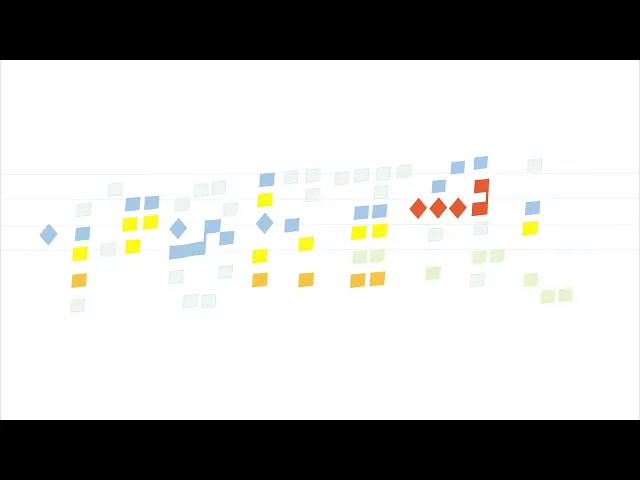
It aims to create a physical experience on the cover for the listener, using texture on the title print and foil as a representation of modern color-printing. The original typeface was created using the album's actual neumatic music notes, translated from modern notation and then implemented on an additional video visual for each of the tracks, creating a digital visual experience and highlighting the notes as they play, seeking to display the calming, timeless emotions the music evokes.
This was a music album meant to represent the different color swatches. There was full creative liberty to use the collaborating brands' color swatches and papers to create an album cover.


CREDITS
Eva Schroeder
2023


